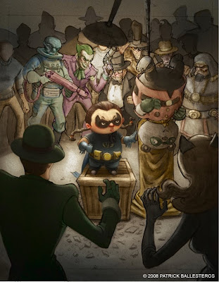
After the line art stage I usually fill the whole canvas with an average tone on a multiply layer so I can preserve my line work first. I figured that my composition would be an overall medium value, with blacks as the next major accent and spotted whites for highlights in my focal area. I use a big brush to block in the major value separations and never zoom in. It's all about the big read at this point so don't bother being too nit picky with staying in the lines. We aren't rendering, we are just going for a good big read. Why is this important? Well let's say I am standing at the front door of a comic book store and your cover is waaaaay back in no man's land, I will be more drawn to it from afar because of the interesting graphic read.

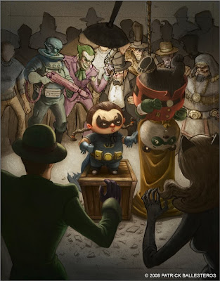
Next phase is the block in of color; you can see the washes of color I put in the background (BG) characters. That was laid in using a variety of color and overlay layers to retain my value structure while creeping up on the color. I am no color expert so I tend to take it slow. I start to render my focal area first (the little girl). Now, this isn't a hard rule but I usually work from the focal point out. This allows me to see how much I want to render the focal and how much I want to not render all the other element. Less is more people. I also start to render out the character in the left foreground (FG) to establish some lighting.

Continuing on, I have rendered both the bear and the girl. I also tweaked her cape a little so we can see more of it on the floor. I made sure the temperature of the cape was cooler so it wouldn't pop out and break the sense of depth. I finished up the crate and deepened the shadows she is casting on it. Since the girl's costume is primarily blue, I was pushing its complement, orange, on the crate. Now, I really grayed it out so it wouldn't be jarring to the eye but by doing that it subtly allowed me to push her out more and reinforce her as the focal.
For the bear, it's the same process as the girl. I am painting opaquely atop my line art at this point and more than anything else I am describing forms....what is facing the light, what is not, thinking planes, and having my shadows inform the forms.

This is where I am at right now. Next I am going to be hitting up the BG cast, the FG, and final lighting. I am also working on another commission so I will start posting the prelims for that one next time. Thanks for looking guys, I'll be back with more I promise!

9 comments:
There's some great work going on in here. Keep it up! Lookin' forward to future posts!
that's pretty nice man - i erally dig the penguin. he has some good shapes.
&REw.
sick stuff as always O_o
anyways i finally update my blog hehe
really nice . i love seeing process and yours is great.
really wonderful.
I really love your progress work patrick!!! I wish I could hang out with you again! But you're too cool for little kids like me. And, I so am working! Maya isn't so bad after all :) not yet ..
anyways, lovely work! I can't wait to see the final~
WOW, thanks guys for the comments.
JP-thank you sir.
Drew-glad you like it man, ur stuff has been super pimp.
Gem-FINALLY AN UPDATE!
Marco-Thank you so much.
Eric-thanks for stopping by glad you are enjoying the images.
Stevie-dude, you know you are welcome to hang out anytime, just bribe us..lol! Glad to hear things are going well with you, I will bug you more.
can you say "Beast!" keep it up Patrick.
-AJ
Always a fan.
Post a Comment